


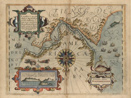
A 1611 map of the Strait of Magellan (South is up)
Never before have we had more ways to find our way. The Internet has made maps—old, new, amazingly accurate, wildly inaccurate, and just plain weird—available to everyone. The range of online maps is so vast that this has been dubbed a golden age of cartography.
So you might assume that the “Best in Show” award at the annual Cartography and Geographic Information Society competition went to a mega-map designed by supercomputers. You’d be wrong. The prize went to David Imus, a veteran cartographer who worked alone in his Oregon farmhouse for some 6,000 hours to create his map, “The Essential Geography of the United States of America.” The map is 4 feet by 3 feet, extremely detailed, and yet remarkably clear. For example, major tourist attractions are noted for big cities. All state boundaries are green, which saves other colors for more important uses, such as the extent of populated areas. Airports are marked with their three-letter codes. Topography is depicted realistically.
If you can’t buy a copy of the Imus map, go online for dazzling cartographic displays. Huge map collections, such as the one at the University of Texas at Austin, are being placed online. Specialized sites offer interesting cartographic adventures. For example, you can see countries expand or contract according to their rank in various measurements. Another site shows how far the Great Wall of China would stretch if it started at your house. Or, you can find not one, but two 19th-century maps that show the United States in the shape of a pig! So, go hog wild and enjoy the worlds that are literally at your fingertips.
Image credit: Library of Congress, Prints and Photographs Division
Related Links
-
The Greatest Paper Map of the United States You Will Ever See
Find out why David Imus’s map is so special. Examine the close-up details for a comparison with another map.
(Source: Slate, January 2, 2012) -
Perry-Castañeda Library Map Collection
Peruse old and new maps related to a range of topics at this University of Texas at Austin site.
(Source: University of Texas at Austin; accessed January 31, 2012) -
How Big Really?
Compare the extent of various events, monuments, and ancient cities to your city or state.
(Source: BBC Dimensions; accessed January 31, 2012) -
Strange Maps
Find those examples of “porcineography” here.
(Source: Big Think; accessed January 31, 2012) -
Worldmapper: The World as You’ve Never Seen It Before
Examine maps where territories are re-sized according to the subject of interest.
(Source: Worldmapper; accessed January 31, 2012)
this is a very long story and it was kinda instresting but kinda fun and boring at time